

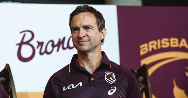
The new Broncos logo meaning sits at the centre of Brisbane’s largest identity shift in more than two decades — a full rebrand arriving just one year after the club completed a rare NRL/NWL premiership double in 2025.
This overhaul reflects where Brisbane sees itself heading: into a decade shaped by the 2032 Olympics, global exposure, and an increasingly competitive rugby league landscape. Months before the official rollout, an IP Australia leak accelerated public interest and forced the club to manage scrutiny from the moment the emblem surfaced.
Heading into 2026, the Broncos are reshaping how they present themselves — and how they want the world to see the club.
How the Rebrand Began: Leak, Consultation & Strategic Intent
The path to the new era didn’t start with a launch event — it started with a mistake. An accidental IP Australia leak, picked up by The Age/SMH masthead, revealed the forward-facing horse design well before its intended reveal. This pushed the Broncos to adapt their timeline while maintaining discipline around the broader 18-month brand project.
Stakeholder input came from players, coaches, staff, commercial partners and selected fan groups. DDB Group — the same global branding agency behind Juventus’ transformation — led the creative direction, ensuring the new identity aligned with modern sports branding.
New Broncos Logo Meaning — Key Points Table
| Element | Explanation |
|---|---|
| Forward-facing horse | Symbolises momentum, aggression and modernity — replacing the long-standing side profile. |
| Shield shape | References the club’s 1988 foundation and early visual identity. |
| Central line | Represents the Brisbane River cutting through the heart of the city. |
| “Brisbane” wordmark | First time the club prioritises city identity over the “Broncos” name. |
| Minimalist styling | Follows global sport trends toward simple, scalable, modern marks. |
With Brisbane preparing for the 2032 Olympics, the club positioned the rebrand to align more closely with the city’s long-term vision — a theme repeated throughout internal discussions.
New Broncos Logo Meaning, Jersey Changes & The ‘We Charge On’ Mantra
The new Broncos logo meaning is built around forward motion: a horse charging head-on rather than sideways. Designers emphasised that the shield shape reconnects the club with its origin story, while the river line grounds the emblem in local geography.
Why “Broncos” Was Removed
Leadership, including CEO Dave Donaghy, outlined several goals:
- Create global recognition through a simpler, city-first identity.
- Position the Broncos alongside modern global brands (Juventus, Inter Miami).
- Establish Brisbane as a central sporting identity heading toward 2032.
- Strengthen territorial presence amid Dolphins expansion.
Critics — including Corey Parker and Ian Healy — argued that removing “Broncos” weakens emotional connection, while fans were split between embracing modernity or mourning tradition.
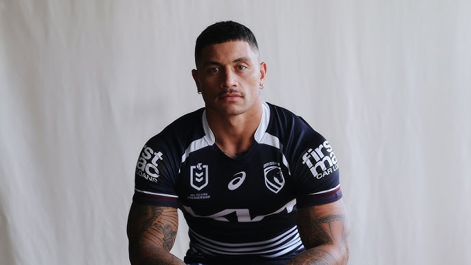
The 2026 Jerseys
- Home jersey: updated maroon-gold balance, redesigned shoulder lines and cleaner presentation.
- Away jersey: a midnight/navy Cyril Connell tribute — honouring the club’s legendary talent scout and Queensland rugby league architect.
- Heritage cues: stitching patterns and trim referencing older state colours.
“We Charge On”
The 2026 mantra reflects:
- post-premiership hunger
- Maguire’s internal theme of progression
- a fan-facing message of identity through change
It appears across digital campaigns, jersey details and marketing material.
Fan Reaction, Media Debate & The Cultural Picture – New Broncos logo meaning

As with any major sporting rebrand, reaction ranged widely:
Positive themes:
- modern look with sharper global appeal
- simplified emblem easier to use across digital platforms
- city-first branding aligns with Brisbane’s Olympic build-up
Negative themes:
- loss of traditional horse profile
- minimalism feels “too corporate” for some fans
- missing “Broncos” wordmark reduces emotional heritage
Social media sentiment was mixed, especially given the timing after a premiership run. Some fans questioned why a team at its peak would rebrand; others felt success was the perfect moment to reset for the next decade.
The reported $300,000 cost sparked debate, though in global sporting terms it sits relatively low compared with AFL, EPL and U.S. franchise rebrands.
Culturally, the shift pushes the Broncos toward a broader identity strategy — one connected to the wider sporting ecosystem of a rapidly growing city preparing to host the 2032 Olympics.
Conclusion: A New Era, Rooted in History but Facing Forward – New Broncos logo meaning
The Broncos’ 2026 transformation blends modern sports branding with a deep acknowledgement of place, performance and future ambition. From the forward-facing emblem to the Cyril Connell tribute jersey and the “We Charge On” message, the club is preparing for a decade shaped by global attention and domestic rivalry.
And while the debate will continue — as it always does with major sporting identities — the new Broncos logo meaning signals a clear statement: Brisbane is stepping into a new chapter, grounded in its history but firmly charging into what comes next.


